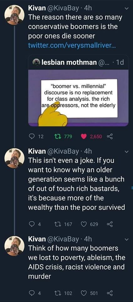
As the “Okay, Boomer” meme crests, the backlash against it has begun:
To my knowledge, no one has proved this with, you know, data. If I wanted to be really salty I could just end the post here. We’re done! Go home! No proof means you shouldn’t share the meme!
A Simple Model
But, let’s take a closer look. Some quick arithmetic can cast more doubt on this and the data doesn’t really back this up. Now, I want to start by not only conceding that the life-expectancy gap is real, but also candidly state that none of what follows is meant to suggest that reducing it shouldn’t be a policy goal. My sole purpose here is to say, “stop sharing this meme with no proof because it doesn’t really hold up”.
The gap between the very richest Americans and very poorest Americans is about 12 years on average. (It’s larger for men, partially due to the gendered nature of hard labor in the United States.) Conveniently, its pretty close to linear:

This is convenient because it allows for a stylized analysis. To avoid doing a linear regression, I used the 20th and 80th percentile points as samples and found the lines through each the male and female lines. Then I averaged the two. Because the errors are obviously pretty small*, we can rely on the following formula for our estimates:

Where E is a person’s life expectancy and P is their percentile in the income distribution. This was a lot of work to make a simple point. The difference between the bottom and the middle is 4 years and, likewise, the bottom and the top is 8*. Consider Boomers born in 1946, the very oldest boomers. Even the poorest boomers are still 5 years from life expectancy. The middle of the Boomers, born in 1955, are only just retiring next year and so significantly below the point where this effect would be most noticeable.
Again, we can stop here. A quick check shows that Boomers are young relative to life expectancy, even accounting for the effects of poverty.
Let’s Go All In
Now, people don’t automatically drop dead at their life expectancy—in fact, life expectancy has a pretty large standard deviation: 15 years. This means we can estimate the life expectancy gaps for each year after birth:
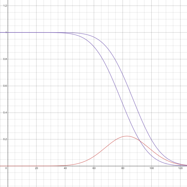
The purple curves are my estimates of what percentage of a birth cohort are alive at each year assuming deaths are normally distributed around the expected (average) death; the higher one, of course, is the richest 1% and the bottom one the poorest. The red curve is the difference. The gap gets the widest, 22% at 85 years old**.
Using averages across the 18 years of the Boomer Generation, we can show what the difference should be across time, here the green curve. The zero-year here is 1946, and 2019 is marked in purple:

So, the effect is pretty moderate, at 11%. But we’ve slipped one last assumption under the rug: lockstep class-voting analysis. The class-voting link is pretty moderate, with the poor voting only about 2:1 for Democrats and the rich almost perfectly reversing that. This probably evens out with the skew I introduced by assuming a normal distribution. We’re pretty far into the weeds at this point; the point here is that this effect isn’t that strong and so the meme is not that convincing.
But That’s Not All
That’s a neat model, no matter its shortcomings, but has an 11% change manifested since 2000? Not really:
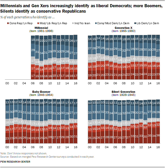
While its true there has been a trend for the “lean republican” Boomers to become stauncher republicans, its not been effecting the conservative/liberal split very much. Further, a breakdown of the data for white voters indicates that its Gen Xers and younger Boomers who are driving the trend right; older Boomers—those most effected by the death gap—have been stable moderates for the last few years. I would concede the shortcomings of looking at data for white voters specifically, except it seems to be besides the point. Pew’s data is for all voters and shows the same consolidation to the far right among Gen Xers and Boomers. Unless the Gen Xers are dying off at rates equal to the oldest Boomers—and, no, that’s not happening—its probably safe to assume its mostly a change in public opinion among younger Boomers, not a function of deaths.
Worth noting that the rightward trend only shows up by about half in the Silent Generation; my model predicts a split of 21% for the Silent generation; Pew’s data shows a conservative drift since 2000 of only 10%. Given that class and voting are not lockstep, we can tentatively take that as suggestive that the effect identified in the meme is real, but small. Likewise, my model predicts a 9% change for the Boomers and the pew data finds 5%, further suggesting that if this is not coincidence, the effect is about half of my model.
Conclusion
So let’s take a step back. We’re looking at a 5% change in the Boomer generation’s voting patterns over a decade and a half. When looking at the claim “the reason why there are so many conservative Boomers is the poor ones die sooner”, its worth asking if 5% is really that big of a change. The numbers I’ve found seem to back the direction of the analysis, but when looking at the magnitude, I have to ask, is it that noticeable? If you took a small, random sample Boomers in 2000 and now to interact with, bias from random chance would be more noticeable than the partisan shift. And you’re kidding yourself if you think in the US you’re interacting with a random sample of Boomers given de facto race and class segregation.
So, sure, I’ve convinced myself the death gap effect is real, but all evidence suggests its would be hard to notice outside of statistical analysis.
*The biggest source of error in this equation if I were to use a linear regression would be the bottom 3%. As a consequence, my range is significantly smaller than the simple range given in my source. While the unique struggles of the bottom 3% deserve to be addressed, they add nearly 3 years to the range on their own and its representative to use them.
**By using a normal distribution, I’ve wayyyy overestimated the number of centenarians. But I think the basics of the point would hold up for a more left–skewed distribution, and, at any rate, we’ll see this model is not well borne out in the data no matter how you slice it.
